
A Practical Guide to Kitchen Painting Ideas for Cabinets
Repainting kitchen cabinets is one of the most efficient ways to refresh your space. The right color, finish, and detailing can shift a kitchen from busy to calm, dark to bright, dated to current—often without changing the layout. This guide walks you through practical, durable ideas for choosing colors and finishes, pairing them with your kitchen’s surfaces, and validating your choices before you paint.
Start with a style and color strategy
Before pulling swatches, anchor your plan to a style direction. This helps narrow choices and ensures the cabinets complement existing elements like floors, counters, and backsplashes.
- Modern/minimal: Favor streamlined tones—crisp whites, charcoal, soft black, or quiet mid-grays. Keep contrast deliberate and hardware simple.
- Transitional: Blend classic and modern with versatile neutrals—warm greige, stone, mushroom, or muted blue/green. Two-tone schemes work well here.
- Traditional/classic: Consider off-whites, cream, navy, forest green, or rich taupes. These play nicely with paneled doors and crown details.
- Coastal/airy: Explore soft whites, pale blues, foggy grays, and sand-inspired beiges to emphasize light and openness.
- Bold/color-forward: Jewel tones (deep teal, emerald, inky blue) or saturated earth hues (terracotta, olive) can create a distinctive focal point.
To avoid clashing, let one major surface lead. If your countertops are busy or high-contrast, choose simpler cabinet colors. If your counters and backsplash are quiet, cabinets can carry more color.
Smart palette ideas that work
When selecting a cabinet palette, aim for a plan you’ll still love in five years. The following ideas balance trend awareness with long-term appeal.
- Crisp white or off-white: A perennial favorite that brightens smaller or low-light kitchens. Off-whites soften glare and hide minor wear better than true white.
- Layered neutrals: Pair light uppers (warm white or pale greige) with slightly deeper lowers (stone, putty) for gentle depth without stark contrast.
- Moody deep tones: Charcoal, soft black, and indigo add sophistication. Balance them with ample lighting and light counters/walls to avoid a cave effect.
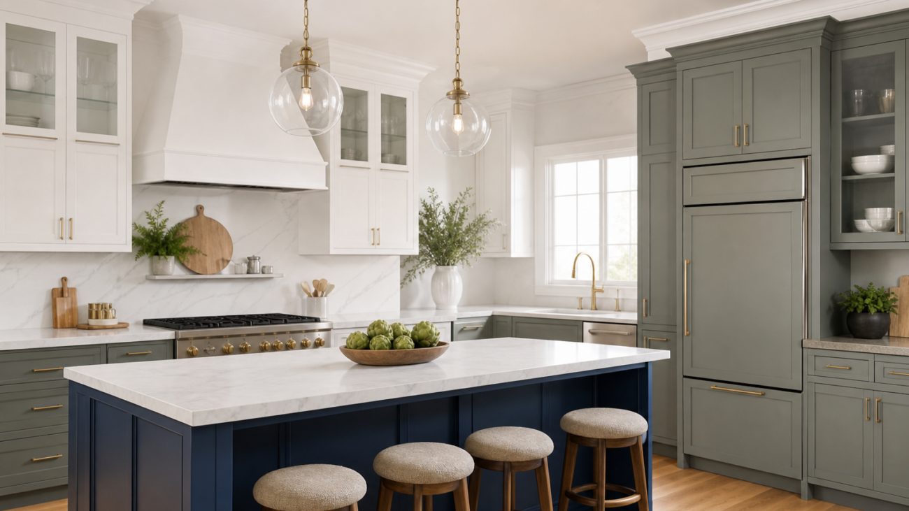
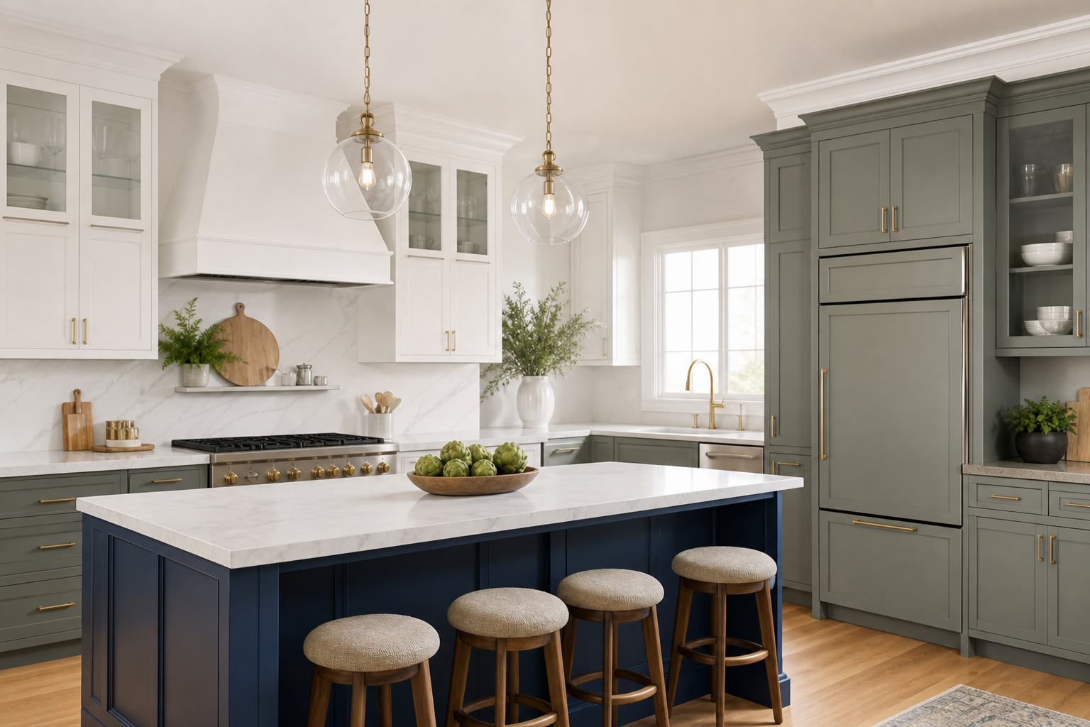
- Nature-inspired greens: From sage to olive, greens feel grounded and pair well with wood floors, brass hardware, and organic textures.
- Blue-gray spectrum: Muted blues with gray undertones deliver calm while staying versatile with stainless, nickel, or brass fixtures.
- Warm earth palette: Mushroom, taupe, and clay tones complement warm metals and stone-look surfaces for an inviting, collected look.
Tip: If you’re torn between two close shades, select the slightly warmer option in north-facing or cool-light kitchens and the slightly cooler option in south-facing or warm-light kitchens. This balances how daylight shifts undertones.
Two-tone and contrast ideas
Two-tone cabinet schemes provide structure and interest without overwhelming the eye. Use contrast intentionally so the design feels anchored.
- Light uppers, darker lowers: A classic approach that keeps sight lines open while adding depth at the base.
- Island as an accent: Keep perimeter cabinets neutral and choose a contrasting island—navy, black, or deep green—to create a central focal point.
- Glass-front harmony: Paint glass-front uppers a lighter, softer tone than adjacent solid-door uppers to highlight displayed items without clutter.
- Frame vs. panel emphasis: On inset or shaker doors, a subtle shade shift between the frame and panel can add texture without loud contrast.
For successful two-tone plans, repeat your accent color in at least one other place—bar stools, a runner, or a small appliance—to create cohesion.
Finishes, sheens, and textures
Finish choice affects both appearance and upkeep. Think beyond color swatches—sheen and texture change how a shade reads.
- Matte/flat: Great for hiding minor surface imperfections and delivering a soft, modern look. It can show handprints more readily, so plan for routine wipe-downs.
- Eggshell/satin: The most versatile sheens for cabinets, balancing cleanability with a refined glow that isn’t too reflective.
- Semi-gloss: Durable and wipeable with a crisp, classic feel. It highlights profiles and edges but can also accentuate flaws; prep becomes extra important.
- Subtle texture: Light brushing or intentional grain visibility can add organic character, especially in nature-inspired palettes.
Consistency matters: keep sheens the same across all cabinet faces for a professional, unified appearance.
Hardware and details that make color sing
Cabinet color doesn’t work in isolation. Hardware, lighting, and small accents determine whether a color feels intentional or improvised.
- Warm metals (brass, bronze): Complement greens, blues, and warm neutrals. They enhance cozy undertones.
- Cool metals (chrome, nickel, stainless): Pair well with crisp whites, blue-grays, and charcoal for a cleaner, contemporary edge.
- Black hardware: Adds graphic definition on light cabinets and feels modern on mid-tone colors.
- Edge profiles: Shaker and slab doors suit simple pulls; detailed profiles often look best with classic knobs or a knob-pull mix.
Match hardware finish to at least one other element (faucet, light fixtures, or frames) to knit the palette together.
Sample, test, and validate your choice
Color shifts dramatically with lighting and surrounding finishes. Testing is the most reliable way to avoid surprises.
- Create large samples: Paint sample boards or a spare door rather than relying on tiny chips. At least 11×14 inches helps you judge undertones.
- View in different light: Check morning, midday, and evening under ambient, task, and accent lighting. Note any green, purple, or pink casts you didn’t expect.
- Compare against fixed elements: Hold samples against floors, counters, and backsplash. If a color improves the look of these surfaces, you’re on the right track.
- Decide sheen last: Once the color is set, test sheen in the same tone. A satin sample can look deeper or lighter than matte under the same light.
Document your finalists with photos taken at the same time of day to make an apples-to-apples comparison.
Prep and painting basics to protect your result
Even the best color can disappoint if the surface prep is rushed. A clean, sound substrate and a sensible process make painted cabinets look better for longer.
- Label and organize: As you remove doors and drawers, label them and bag hardware by cabinet. This keeps reveals and hinge alignments consistent on reinstallation.
- Degrease thoroughly: Kitchens accumulate residue that can interfere with adhesion. A thorough clean and rinse before sanding is essential.
- Sand for tooth: A uniform scuff-sand promotes bonding. Focus on high-touch areas (edge pulls, around knobs) and any glossy factory finishes.
- Repair and fill: Address dings, separated joints, or grain irregularities. Let fillers cure and sand smooth before priming.
- Prime with purpose: Primer choice influences coverage, stain blocking, and final smoothness. Allow full dry time and sand lightly between coats.
- Apply thin, even coats: Whether brushing, rolling, or spraying, multiple thin passes minimize texture and drips. Observe recoat windows.
- Cure fully before heavy use: Dry-to-touch is not the same as cured. Avoid heavy cleaning or reinstalling child locks and bumpers until the finish hardens.
If you’re new to cabinet painting, start with a less-visible bank of doors to lock in your technique before moving to the main focal areas.
Color ideas by kitchen feature
Use your kitchen’s fixed elements to steer color direction. These pairings often work reliably:
- Warm wood floors: Sage, olive, mushroom, or creamy off-whites complement honey or walnut tones.
- Cool stone counters: Blue-gray, crisp white, and charcoal hold their own against marbles and quartzites with gray veining.
- Busy patterned surfaces: Choose quieter cabinet colors (soft white, greige) to let counters or backsplash be the star.
- Stainless appliances: Charcoal, white, and blue-grays deliver a coordinated, professional look.
- Matte black appliances: Deep green, warm white, or matching black create bold cohesion; ensure adequate lighting.
Lighting and space perception
Lighting changes how colors read and how large a space feels. Plan cabinet colors with light placement and intensity in mind.
- Low natural light: Favor lighter cabinets or mid-tones with warm undertones. Add under-cabinet task lighting to prevent shadows.
- Abundant daylight: You have more freedom for deeper or cooler colors. Validate that bright midday light doesn’t wash out pale shades.
- Small kitchens: Lighter uppers and tone-on-tone walls prevent visual breaks and help the space feel more open.
- Large kitchens: Consider two-tone schemes to add rhythm and avoid a flat sea of one color.
Maintenance and touch-up tips
Good habits protect your finish and preserve color clarity.
- Gentle cleaning: Use soft cloths and mild cleaners. Avoid abrasive pads that can burnish or dull sheen.
- Ventilation: Run a hood fan when cooking to reduce oily build-up, especially near ranges.
- Bumpers and hardware care: Add clear door bumpers to reduce paint-on-paint contact; tighten loose pulls promptly.
- Keep a labeled touch-up jar: Save a few ounces of your exact paint and note the sheen. Test touch-ups in an inconspicuous spot first.
Decision checklist before you paint
Use this quick list to confirm you’re ready:
- You’ve named your style direction and primary cabinet color.
- You’ve chosen a sheen suitable for your cleaning routine.
- Countertops, backsplash, floors, and appliances have been evaluated against large, painted samples.
- Accent color (for island or lowers) repeats elsewhere for balance.
- Hardware finish is coordinated with at least one other element.
- Prep steps and curing time are scheduled realistically.
- Lighting levels are adequate for your chosen depth of color.
FAQs
What cabinet colors are the most versatile over time?
Soft whites, off-whites, balanced greiges, and gentle blue-grays tend to work across many countertop and floor combinations. If you want depth without risking trend fatigue, consider charcoal or navy used selectively—on a center island or lower cabinets—paired with lighter uppers.
Should I use the same color on walls and cabinets?
You can, but vary sheen to prevent a monotone look. For example, paint cabinets in satin and walls in matte or eggshell. If your kitchen is small or has complex tile patterns, keeping walls and cabinets in the same color family (one or two steps apart) can feel cohesive without being flat.
How do I choose between satin and semi-gloss?
Both are practical for kitchens. Satin offers a softer, modern look and helps disguise small imperfections. Semi-gloss highlights profiles and reads crisp and classic, but it shows surface flaws more readily. If your doors have noticeable dings or grain telegraphing, satin is often the safer bet.
Is a dark cabinet color too risky for a small kitchen?
Not necessarily. If you love deep hues, keep uppers light and use the darker tone on lowers or the island. Ensure strong task and ambient lighting so the space still feels open and functional.
Do two-tone kitchens go out of style?
Two-tone is a design tool rather than a fad when used thoughtfully. Keep one tone neutral and repeat the accent color in small doses elsewhere. This approach reads intentional and tends to age well.