
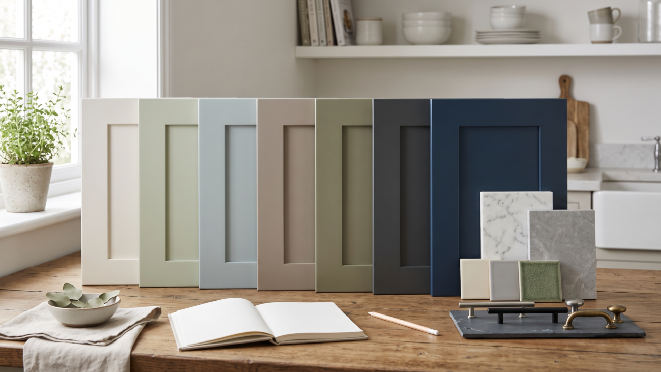
7 Cabinet Color Update Ideas for a Cohesive Kitchen
Short answer: A cabinet colour update can change how the entire kitchen feels, but the strongest choice rarely starts with a list of fashionable shades. It starts with the room you already have. Countertops, flooring, backsplash, appliances, natural light and nearby rooms all affect whether a colour looks calm, flat, warm, cool or unexpectedly intense.
This guide turns cabinet color update ideas into a practical selection process. Use it to narrow the field, compare undertones, decide whether one or two colours make sense, and approve a finish with fewer surprises. It is written for homeowners considering refinishing existing cabinets, not for anyone who needs to replace a damaged or poorly functioning cabinet layout.
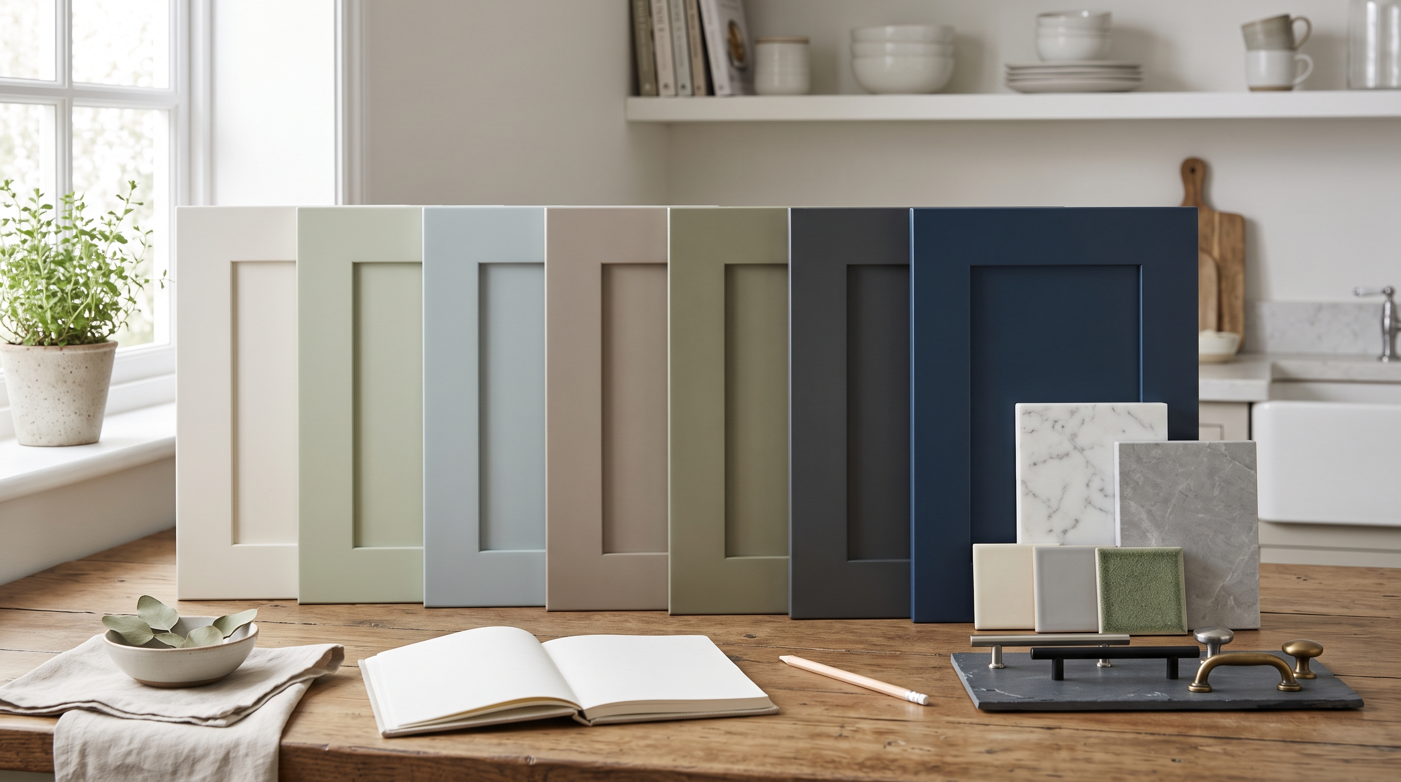
The seven ideas at a glance
- Start with fixed surfaces that will remain.
- Sort samples by compatible undertones.
- Give the cabinet colour one clear design job.
- Use two colours only when the split clarifies the room.
- Test large samples in changing natural and artificial light.
- Review sheen and colour on a realistic prepared surface.
- Document the final colour, sheen and placement.
Begin with the surfaces that are staying
Cabinet doors occupy a large visual area, yet they are only one part of the palette. Before opening a colour deck, list every fixed or expensive-to-change surface that will remain after the project. Include the countertop, backsplash, floor, wall colour, major appliances, sink, faucet and visible metal finishes. In an open plan, include the nearest dining or living-room finishes too.
Take clear photos in daylight and at night, then describe each fixed surface in plain language. Benjamin Moore’s cabinet-colour guidance similarly recommends looking to countertops, backsplash, fixtures and flooring for colour cues. Is the countertop mostly warm cream, cool white, charcoal, brown, green or blue? Does the floor read orange, red, grey or neutral? Are there strong patterns that should remain the focal point? This simple inventory prevents a sample from being judged in isolation.
When several permanent surfaces already have movement or contrast, a quieter cabinet colour often creates balance. When the room is visually simple, cabinets may be able to carry more depth. That is a design choice rather than a universal rule, so compare it against the actual room instead of a staged image online.
Use undertones to build a short list
Two samples can both be labelled white, grey or beige and still behave very differently. The difference is often the undertone: the subtle warm, cool, green, blue, violet, yellow or red influence beneath the main colour. Undertones become easier to see when samples are placed beside each other and beside the room’s fixed finishes.
A useful first pass is to sort candidates into three groups:
- Compatible: the sample relates naturally to at least one fixed finish and does not create an obvious clash.
- Possible: the sample could work, but its undertone changes noticeably with the light or nearby surface.
- Release: the sample repeatedly fights the countertop, floor or backsplash, even if it looked appealing online.
Keep the short list small. Three to five serious candidates are easier to assess than twenty small chips. If every option feels wrong, return to the fixed-surface inventory. The issue may be the colour family rather than the exact shade.
Compare cabinet colour families by the job they do
Colour names vary by manufacturer, so focus on the role a family can play in the room. The table below is a starting point, not a promise that a family will suit every kitchen.
| Colour direction | What it can contribute | What to check carefully |
|---|---|---|
| Warm white or cream | A bright, soft background that can connect with warm stone and wood | Whether it turns yellow beside a cooler counter or appliance |
| Soft greige or taupe | A quieter bridge between warm and cool finishes | Whether green, violet or pink undertones emerge in shadow |
| Muted green | A grounded accent that can relate to wood, stone and plants | Whether the backsplash or counter introduces a competing green |
| Blue or blue-grey | Clear contrast with warm wood and some brass-toned details | Whether low light makes the colour colder or heavier than expected |
| Charcoal or near-black | Depth and definition, especially on a contained feature | Room brightness, visible dust, fingerprints and contrast with the floor |
| Natural wood plus paint | Warmth and variation without relying on two painted colours | Whether the existing grain, door condition and finish can support the plan |
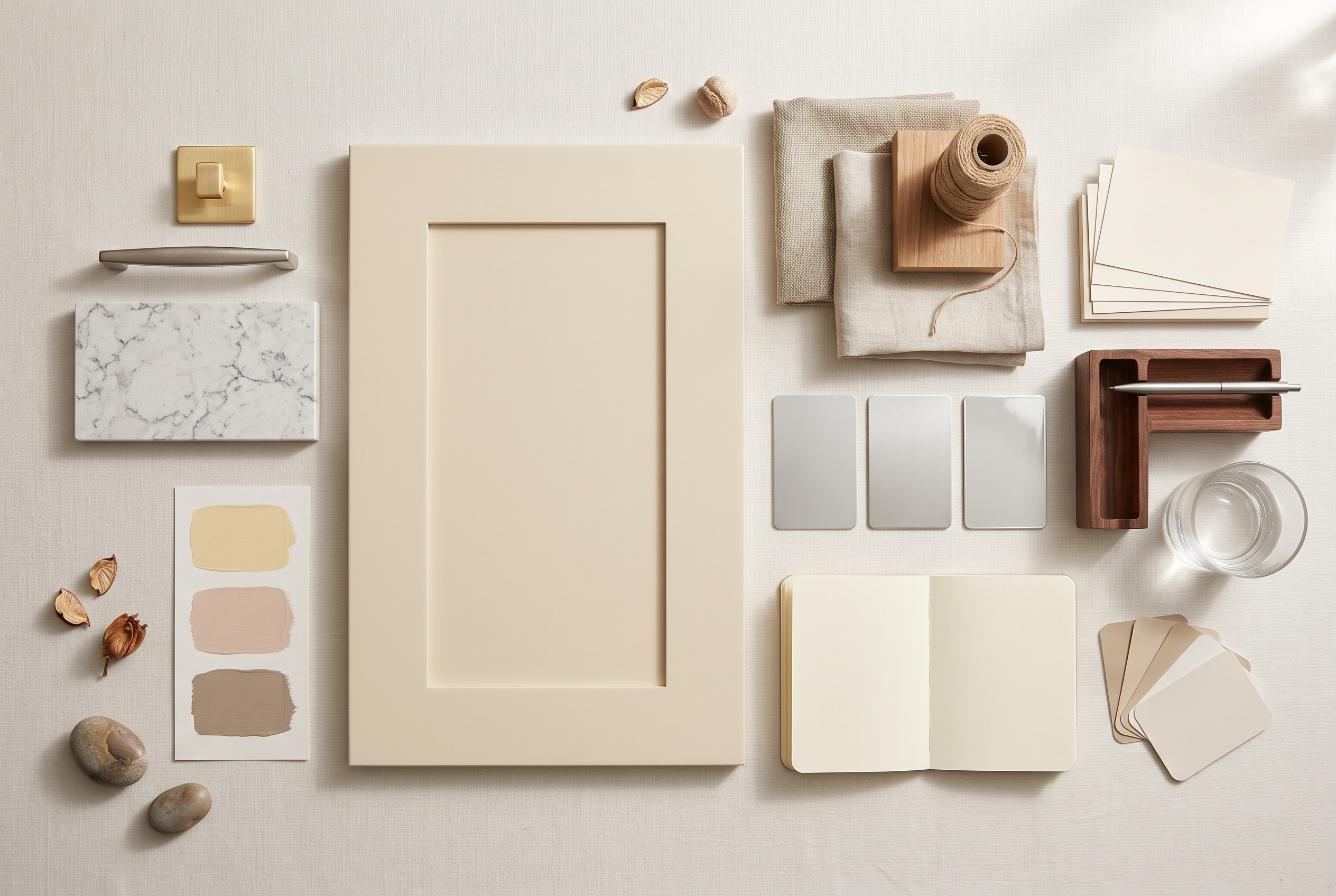
Instead of asking which colour is best, ask which job the cabinets need to perform. Should they visually recede, warm the room, connect two surfaces, add a focal point or reduce the dominance of a busy pattern? A clear job makes it easier to eliminate attractive colours that do not help this particular kitchen.
Decide whether a two-tone update earns its place
Two-tone cabinetry can solve a real design problem, but it should have a reason. A common approach is to use a lighter colour on upper cabinets and a deeper colour on lower cabinets or an island. Another is to keep perimeter cabinets quiet while treating a freestanding hutch or tall pantry block as a feature.
Use two colours when the change clarifies the architecture, connects different finishes or gives a large room a useful focal point. Avoid adding a second colour only because a single sample feels unexciting. The second colour creates more junctions to coordinate with countertops, end panels, crown, toe kicks and adjacent walls.
Map the colour break on a photo before approving it. Confirm which colour appears on gables, fillers, appliance panels, the island back, open shelves and decorative trim. Ambiguous boundaries can make a thoughtful concept look accidental once it is installed.
Account for light before approving a sample
Natural light changes by direction, weather and time of day. Artificial lighting adds another variable through colour temperature, brightness and placement. A sample viewed beside a bright window at noon may look different on a lower door across the room after sunset.
Move each large sample to several representative locations: an upper door near the main window, a lower door, a shaded corner, the island and the wall beside the busiest fixed finish. Review it in morning light, afternoon light and the artificial lighting normally used at night. If the kitchen is open to another room, step back and view both spaces together.
Benjamin Moore’s sampling guidance notes that lighting changes how paint colours appear and recommends reviewing samples with the kitchen’s other finishes. Do not rely on a phone screen for final approval. Screens, cameras and online room images alter colour. Digital references are useful for organizing ideas; a physical sample in the actual room is the decision tool.
Test sheen and colour together
Colour and sheen affect each other. A smoother, more reflective finish may look lighter or more vivid in direct light, while a lower-sheen surface can appear softer. The existing door profile also matters because routed details catch light and create shadow differently from a flat slab.
Ask the refinishing professional which finish systems are suitable for the cabinet material and process, then compare realistic samples. A wall-paint chip cannot fully represent the appearance of a completed cabinet door. If possible, review the proposed colour and sheen on a sample door or comparable prepared surface.
Also consider everyday viewing conditions. Very dark colours can make dust, crumbs or mineral marks more noticeable. Very light colours may show grime around high-touch areas. This is not a reason to avoid either direction; it is a reason to include maintenance preferences in the decision.
Follow a measured seven-step colour process
- Photograph and list fixed finishes. Record what stays before selecting what changes.
- Define the cabinet colour’s job. Decide whether it should recede, connect, warm, cool or create a focal point.
- Choose one broad family. Start with a direction such as warm white, taupe, green, blue or charcoal.
- Narrow to three to five candidates. Compare undertones beside the countertop, backsplash and floor.
- Create large physical samples. Small chips make proportion and light changes difficult to judge.
- Review every sample over several days. Move it through bright, shaded and evening conditions.
- Document the final specification. Record manufacturer, colour name and code, sheen, colour placement and approval sample.
If the project is moving toward professional refinishing, review Paint2decor’s refinishing process and ask how colour approval fits into the job sequence. A documented decision gives the homeowner and project team one reference point.
Common cabinet colour mistakes to avoid
Choosing from a trend photo alone
The photographed kitchen has different light, materials, camera settings and editing. Borrow the idea, then test it against your room.
Ignoring the countertop undertone
Cabinets meet the counter across long horizontal lines. Compare samples directly at that junction, not on an unrelated wall.
Testing only one tiny chip
A single small chip hides comparison information. Use larger samples and compare several close candidates side by side.
Approving colour without defining placement
For two-tone plans, name every visible panel and trim piece. The colour break should be intentional from all normal viewpoints.
Treating colour as a repair
Paint can change appearance, but it does not correct failing hinges, damaged boxes, unsuitable layouts or unresolved moisture. Separate the condition assessment from the colour decision.
Know when refinishing may fit the project
A colour update is most straightforward when the cabinet boxes and doors remain functional and the main goal is a new finish. If the layout, storage, door style or cabinet condition needs major change, compare refinishing with refacing or replacement before committing to colour.
Paint2decor’s live cabinet refinishing services page outlines the company’s current service categories. Use the live site and a project-specific assessment to confirm service fit, material compatibility, scope, preparation, finish options, schedule and commercial terms. Do not assume that an inspiration image represents an available product or a guaranteed result.
Final cabinet colour approval checklist
- Every countertop, backsplash, floor and appliance finish that will remain has been considered.
- The selected colour has been reviewed in morning, afternoon and artificial light.
- A large physical sample has been viewed on upper, lower and shaded cabinet areas.
- The colour and sheen have been considered together on a suitable surface.
- Two-tone boundaries, end panels, fillers, trim and island surfaces are documented.
- The cabinet condition and project method have been assessed separately from colour.
- The final manufacturer, colour code, sheen and approval sample are recorded.
Frequently asked questions
Should cabinets be lighter or darker than the walls?
Either can work. Contrast makes the cabinet outline more visible, while a close relationship can feel quieter. Judge the combination with the floor, counter, backsplash and room light rather than using one formula.
Can upper and lower cabinets be different colours?
Yes, when the split helps the room. Define where each colour stops, test both beside the countertop and confirm how side panels and tall cabinets will be treated.
How many cabinet colours should I sample?
Start broad, then narrow to three to five serious candidates. Large samples viewed over several days usually provide more useful information than a large collection of tiny chips.
Can I approve a cabinet colour online?
Online images can help build a shortlist, but they should not be the final approval tool. Screens and photography alter colour, and they cannot reproduce the light or fixed finishes in your kitchen.
What should I ask before booking cabinet refinishing?
Ask how the cabinet material and condition will be assessed, what preparation and finish system are proposed, how the colour and sheen are approved, what surfaces are included, and which schedule and care instructions apply to the specific project.