
Your kitchen cabinets set the entire tone for your home’s most important gathering space. The right color choice transforms tired, outdated kitchens into stunning showpieces that impress guests, delight family members, and boost property value. Discover the kitchen cabinet color trends 2025 that Toronto homeowners are embracing to create spaces that feel both current and timeless.
Color trends in kitchen design evolve continuously, reflecting broader cultural shifts, design innovations, and changing lifestyle preferences. What felt fresh five years ago might now appear dated, while emerging palettes offer exciting possibilities for personal expression and aesthetic impact. Understanding current trends helps you make informed choices that balance contemporary appeal with lasting satisfaction.
This comprehensive guide explores seventeen stunning cabinet colors dominating Toronto kitchens in 2025, complete with practical pairing suggestions, psychological impact analysis, and expert tips for selecting the perfect shade for your specific space. Whether you’re planning a complete renovation or simple cabinet refinishing, these trending colors provide inspiration and direction for creating the kitchen you’ve always envisioned.
Top 5 Most Popular Kitchen Cabinet Color Trends 2025 Toronto Homeowners Choose
Five cabinet colors consistently dominate Toronto kitchen renovations in 2025, earning their popularity through versatility, timeless appeal, and proven market value. These trending shades work beautifully across architectural styles, from historic Victorian homes to modern condominiums, making them safe yet sophisticated choices for discerning homeowners.
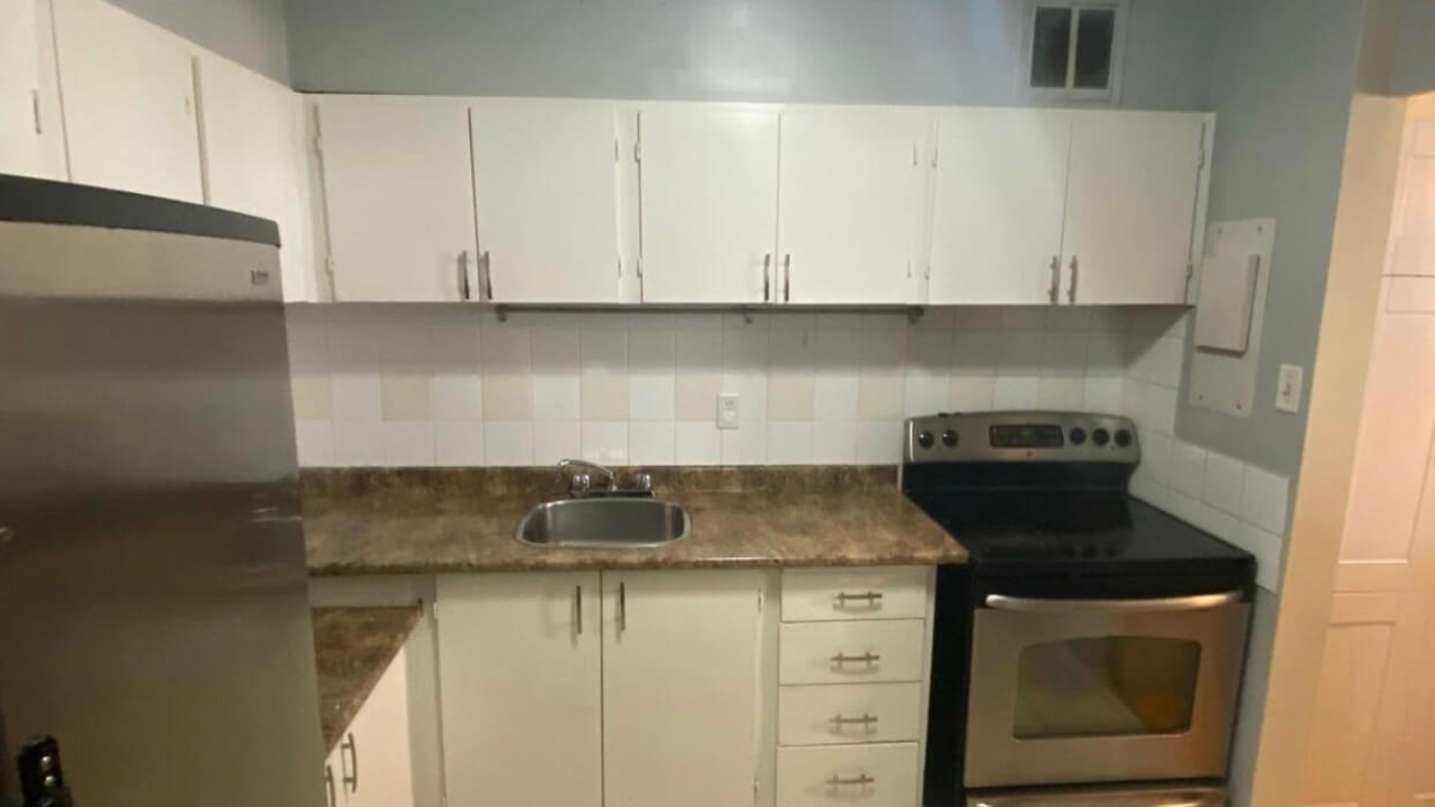
Classic White: The Timeless Champion
Color Profile: Pure White, Cloud White, Simply White
White cabinets maintain their position as Toronto’s most requested color, accounting for approximately forty percent of all cabinet refinishing and replacement projects. This enduring popularity stems from white’s remarkable ability to brighten spaces, create visual spaciousness, and provide a neutral canvas that accommodates changing decor preferences over time.
Best For: Small kitchens needing brightness, traditional and transitional styles, maximizing resale value, creating clean modern aesthetics
Pairs Beautifully With: Marble or quartz countertops, subway tile backsplashes, hardwood or light gray flooring, stainless steel appliances, brass or matte black hardware
Toronto Application: Particularly popular in downtown condominiums where natural light limitations make brightness essential, and historic homes where white complements original architectural details without competing for attention.
White Cabinet Advantages
- Makes small kitchens feel significantly larger and more open
- Reflects natural light beautifully, enhancing overall brightness
- Provides maximum flexibility for changing wall colors and decor
- Appeals to broadest buyer demographic for optimal resale value
- Never truly goes out of style across design eras
- Easy to touch up and maintain long-term appearance
White Cabinet Considerations
- Shows dirt, fingerprints, and cooking splatters more readily
- Can feel sterile or cold without proper warming elements
- May lack personality in spaces craving distinctive character
- Requires regular cleaning to maintain pristine appearance
Sophisticated Gray: Modern Neutrality Perfected
Color Profile: Repose Gray, Agreeable Gray, Cityscape
Gray cabinets surge in popularity among Toronto homeowners seeking contemporary sophistication without bold color commitment. This versatile neutral bridges traditional and modern design sensibilities, offering depth and character while maintaining the adaptability of classic neutrals. Soft warm grays dominate current preferences over cooler blue-toned versions popular in previous years.
Best For: Contemporary and transitional kitchens, creating subtle sophistication, complementing stainless appliances, achieving designer-quality aesthetics
Pairs Beautifully With: White or light gray countertops, glass tile backsplashes, medium to dark wood flooring, brushed nickel or chrome hardware, white or black accent colors
Toronto Application: Extremely popular in renovated Victorian and Edwardian homes where gray provides period-appropriate sophistication with modern sensibility, and new construction townhomes targeting young professional buyers.
Navy Blue: Bold Yet Timeless Elegance
Color Profile: Hale Navy, Naval, Gentleman’s Gray
Navy cabinets represent the sweet spot between dramatic color impact and timeless sophistication. This rich, grounded blue reads as a sophisticated neutral rather than overwhelming color statement, providing depth and character without the commitment anxiety associated with brighter or lighter blues. Navy’s dramatic presence creates stunning focal points while maintaining broad appeal across design preferences.
Best For: Statement-making kitchens, traditional and coastal styles, creating depth in large spaces, homeowners confident in color choices
Pairs Beautifully With: White or cream countertops, white or light gray backsplashes, wide-plank wood flooring, brass or gold hardware, white upper cabinets in two-tone designs
Toronto Application: Trending strongly in Leslieville, High Park, and Beaches neighborhoods where homeowners embrace distinctive character, particularly effective in kitchens with abundant natural light that prevents navy from feeling heavy.
Forest Green: Nature-Inspired Sophistication
Color Profile: Studio Green, Hunter Green, Evergreen Fog
Green cabinets emerge as 2025’s breakout trend color, combining environmental consciousness with sophisticated earthiness. Deep forest greens provide organic warmth that feels both grounded and luxurious, appealing to homeowners seeking distinctive style beyond traditional neutrals. This shade works particularly well in kitchens emphasizing natural materials and biophilic design principles.
Best For: Creating unique personality, complementing natural wood elements, traditional and transitional styles, homeowners embracing color confidence
Pairs Beautifully With: Butcher block or wood-look countertops, white or cream backsplashes, natural wood or terracotta flooring, brass or bronze hardware, warm white or cream walls
Toronto Application: Gaining popularity in Forest Hill, Rosedale, and Lawrence Park where larger homes accommodate bold color choices, particularly effective in kitchens opening to gardens or green spaces that create visual continuity.
Warm Greige: Perfect Balance Achieved
Color Profile: Accessible Beige, Perfect Greige, Balanced Beige
Greige cabinets—sophisticated blends of gray and beige—deliver the warmth homeowners crave with the contemporary edge gray provides. This balanced neutral emerged as the solution to gray’s occasional coldness and beige’s dated associations, creating a versatile foundation that works beautifully with both warm and cool accent colors. Greige represents the ultimate compromise for households where partners disagree on color direction.
Best For: Versatile color foundations, bridging warm and cool elements, creating cozy contemporary spaces, appealing to diverse style preferences
Pairs Beautifully With: Quartz or granite countertops in multiple tones, glass or ceramic backsplashes, any flooring color, diverse hardware finishes, both warm and cool wall colors
Toronto Application: Universally popular across all Toronto neighborhoods, particularly favored in move-up family homes where timeless appeal and broad marketability matter for eventual resale considerations.
Bold and Dramatic Kitchen Cabinet Color Trends 2025 for Statement-Making Spaces
Adventurous Toronto homeowners increasingly embrace bold cabinet colors that create distinctive personality and memorable impact. These dramatic shades work beautifully when thoughtfully integrated with complementary elements, transforming kitchens into unique spaces that reflect confident personal style rather than generic design formulas.
2025 Trend Alert: Rich, Saturated Colors Gain Momentum
After years of safe neutrals dominating kitchen design, homeowners increasingly embrace saturated colors that make bold statements. This shift reflects growing confidence in personal style expression and desire for spaces feeling custom and unique rather than showroom generic.
Charcoal and Black: Sophisticated Drama
Color Profile: Iron Ore, Tricorn Black, Black Magic
Black and charcoal cabinets create stunning contemporary statements that feel both dramatic and surprisingly timeless. These deep shades work exceptionally well in kitchens with excellent natural light or as lower cabinets in two-tone configurations. The key to success lies in balancing darkness with sufficient light-reflecting elements that prevent spaces from feeling cave-like or oppressive.
Best For: Modern and industrial styles, creating dramatic contrast, showcasing beautiful countertops, large kitchens with abundant light
Pairs Beautifully With: White or light gray countertops, white or metallic backsplashes, light wood or concrete flooring, polished chrome or brushed gold hardware, abundant lighting fixtures
Deep Plum and Aubergine: Luxurious Richness
Color Profile: Black Raspberry, Aubergine, Deep Purple
Purple-toned cabinets represent 2025’s most daring trend, appealing to homeowners seeking truly unique kitchens that depart completely from conventional color choices. These rich jewel tones create luxurious, moody atmospheres that feel sophisticated rather than overwhelming when paired with appropriate complementary elements. Plum works particularly well in vintage homes where dramatic color choices align with historical boldness.
Best For: Creating unique personality, Victorian and eclectic styles, confident color enthusiasts, spaces with excellent natural and artificial lighting
Pairs Beautifully With: White or cream countertops, white or gray backsplashes, dark wood flooring, brass or gold hardware, cream or soft gray walls
Sage and Mint: Fresh Contemporary Greens
Color Profile: Clary Sage, Sea Salt, Mint Condition
Lighter, fresher greens gain traction as alternatives to dramatic forest tones, offering nature-inspired color with brighter, more optimistic energy. These soft greens work beautifully in smaller kitchens where darker colors might feel overwhelming, and create serene, spa-like atmospheres that promote calm and wellbeing. Sage particularly appeals to homeowners embracing wellness-focused design principles.
Best For: Creating serene atmospheres, smaller kitchens needing lightness, coastal and cottage styles, spaces emphasizing natural materials
Pairs Beautifully With: White or butcher block countertops, white subway tile backsplashes, natural wood or white flooring, brass or bronze hardware, white or cream walls
Two-Tone Kitchen Cabinet Color Combinations That Define 2025 Trends
Two-tone cabinet configurations dominate 2025 kitchen design, offering visual interest and practical benefits that single-color kitchens cannot match. This approach allows homeowners to incorporate both safe neutrals and bolder accent colors, creating depth and dimension while accommodating diverse style preferences within single spaces.
Popular Two-Tone Combinations
Upper cabinets in lighter shades, lower cabinets in darker or bolder tones
Classic White Upper with Navy Lower Cabinets
This combination ranks as 2025’s most requested two-tone configuration, balancing navy’s dramatic sophistication with white’s brightening properties. Upper white cabinets reflect light and create vertical spaciousness while navy lowers ground the space and hide inevitable wear better than lighter options. The contrast creates dynamic visual interest without overwhelming smaller kitchens or feeling too bold for conservative tastes.
White Upper with Forest Green Lower Cabinets
This nature-inspired combination brings organic warmth while maintaining bright, airy upper areas. Green lowers connect kitchens to outdoor views and natural elements while white uppers prevent the space from feeling too enclosed or heavy. This pairing works exceptionally well in homes emphasizing sustainable materials and biophilic design principles throughout.
Gray Upper with Charcoal Lower Cabinets
Tonal two-tone combinations using different shades within the same color family create sophisticated, designer-quality results without bold color commitment. Light gray uppers paired with charcoal lowers provide depth and dimension while maintaining neutral versatility. This monochromatic approach feels contemporary and cohesive, appealing to minimalist sensibilities.
All-White with Colored Island Cabinet
Keeping perimeter cabinets neutral while introducing bold color exclusively on the kitchen island represents the perfect entry point for color-curious homeowners. This approach allows dramatic color impact in a contained, manageable area that feels less permanent and risky than full-kitchen color commitment. Popular island colors include navy, forest green, black, and deep plum.
| Two-Tone Combination | Style Vibe | Best For | Toronto Popularity |
|---|---|---|---|
| White + Navy | Classic Contemporary | Most kitchen sizes and styles | Very High |
| White + Forest Green | Organic Modern | Nature-inspired designs | High |
| Gray + Charcoal | Sophisticated Minimalist | Contemporary spaces | High |
| White + Black | Dramatic Modern | High-contrast statements | Medium-High |
| Cream + Sage | Soft Traditional | Cottage and farmhouse styles | Medium |
Color Psychology: How Kitchen Cabinet Colors Affect Your Mood and Daily Experience
Cabinet colors influence more than aesthetics alone—they impact psychological responses, emotional states, and even behavioral patterns within kitchen spaces. Understanding color psychology in interior design helps you select shades that support your desired atmosphere and enhance daily kitchen experiences beyond surface-level visual appeal.
White Cabinets: Clarity and Cleanliness
White promotes feelings of cleanliness, freshness, and spaciousness. This color creates crisp, organized atmospheres that support focused activity and efficient workflow. However, excessive white without warming elements can feel sterile or cold, potentially reducing the cozy warmth many families desire in kitchen gathering spaces.
Blue Cabinets: Calm and Trust
Blue tones promote calmness, reduce stress, and create serene environments that encourage relaxation and conversation. Navy and deeper blues add sophistication and confidence, while lighter blues inspire tranquility and openness. Blue kitchens often become favorite gathering spaces where family and friends naturally congregate and linger comfortably.
Green Cabinets: Balance and Harmony
Green connects us to nature, promoting balance, renewal, and wellbeing. This color reduces eye strain and creates harmonious environments that feel both refreshing and grounding. Green kitchens support mindful cooking practices and create atmospheres where healthy food preparation feels natural and aligned with environmental values.
Gray Cabinets: Sophistication and Neutrality
Gray provides sophisticated neutrality that feels contemporary without strong emotional associations. This versatile shade creates professional, organized atmospheres perfect for efficient cooking while providing flexible backdrops for changing decor and personal expression through accessories and accent colors.
Black and Charcoal Cabinets: Drama and Elegance
Dark colors create dramatic, elegant atmospheres that feel sophisticated and intentional. Black and charcoal promote focus and seriousness while adding luxurious weight to spaces. These powerful neutrals work best balanced with adequate lighting and light-reflecting surfaces that prevent oppressive or cave-like feelings.
Choosing the Perfect Kitchen Cabinet Color for Your Toronto Home’s Specific Style
Architectural style, existing finishes, natural lighting conditions, and personal preferences all influence ideal cabinet color selection. Strategic color choices that honor your home’s character while reflecting contemporary sensibilities create cohesive results that feel both current and appropriately contextual to surrounding elements.
Victorian and Edwardian Toronto Homes
Best Cabinet Colors: White, Navy, Forest Green, Deep Plum
Toronto’s beautiful historic homes feature architectural details that pair beautifully with both classic white and bold dramatic colors that reference Victorian-era boldness. White cabinets honor period simplicity while providing modern brightness, while navy and forest green echo rich colors popular during these homes’ original eras. Deep plum works exceptionally well in Victorian homes where dramatic color choices align with historical authenticity.
Avoid: Ultra-modern grays or industrial colors that conflict with ornate period details and warm wood trim typical in these homes.
Modern Toronto Condominiums
Best Cabinet Colors: White, Light Gray, Charcoal, Two-Tone Combinations
Contemporary condo kitchens typically feature clean lines, minimal ornamentation, and open-concept layouts that benefit from light-reflecting whites and sophisticated grays. These colors maximize perceived space in typically compact condo kitchens while complementing modern appliances and minimalist design sensibilities. Two-tone combinations add visual interest without requiring additional square footage.
Avoid: Heavy colors like forest green or plum that can overwhelm limited space, and overly traditional colors that conflict with contemporary architecture.
Mid-Century Toronto Homes
Best Cabinet Colors: White, Warm Wood Tones, Sage Green, Mustard Yellow Accents
Toronto’s abundant post-war housing stock features clean mid-century lines that pair beautifully with period-appropriate colors. White cabinets honor mid-century simplicity while natural wood tones reference the era’s material honesty. Sage green and muted yellows echo popular mid-century accent colors, creating authenticity without feeling dated or kitsch.
Avoid: Ornate traditional colors or ultra-contemporary dramatic darks that conflict with mid-century’s optimistic, streamlined aesthetic.
New Construction Toronto Homes
Best Cabinet Colors: Any Trending Option Based on Personal Preference
New construction offers blank canvas flexibility, allowing homeowners to select any cabinet color that aligns with personal style preferences and desired resale positioning. Consider neighborhood context and target buyer demographics when planning eventual sale. Conservative neighborhoods may favor classic whites and grays, while artistic communities embrace bolder color choices.
Practical Tips for Selecting Your Ideal Kitchen Cabinet Color Toronto Professionals Recommend
Moving from inspiration to confident decision requires systematic evaluation of practical factors beyond aesthetic appeal alone. These professional strategies help you narrow options and select cabinet colors you’ll love for years, avoiding regret and costly do-overs that plague hasty decisions.
Test Colors in Your Actual Kitchen Space
Paint large poster boards in your top color choices and position them in your kitchen for several days, observing how colors appear during different times of day and lighting conditions. Morning light, afternoon sun, and evening artificial lighting all affect color perception dramatically. Colors appearing beautiful in showrooms or online may read completely differently in your specific space with its unique lighting characteristics.
Consider Your Existing Fixed Elements
Cabinet color choices must harmonize with flooring, countertops, backsplashes, and appliances you’re not replacing. Bring samples of these fixed elements when consulting with designers or paint professionals, ensuring your selected cabinet color complements rather than clashes with existing investments. Granite countertops, tile backsplashes, and hardwood floors represent significant investments that influence appropriate cabinet color selection.
Evaluate Natural and Artificial Lighting Conditions
Kitchens with abundant natural light accommodate darker cabinet colors beautifully, while north-facing kitchens with limited natural light benefit from lighter, brighter shades. Consider window size, orientation, and nearby obstructions that affect light quality throughout the day. Artificial lighting also impacts color perception—warm LED bulbs enhance warm colors while cool LEDs complement gray and blue tones.
Think Long-Term Beyond Current Trends
While staying current matters, selecting colors you genuinely love regardless of trends ensures lasting satisfaction. Ask yourself whether you’ll still appreciate your chosen color in five or ten years, considering your decorating preferences and how cabinet colors align with your authentic style rather than simply following what’s popular currently. Trendy colors work beautifully for homeowners who enjoy updating frequently, while classic neutrals suit those preferring timeless longevity.
Factor in Resale Timeline and Market Positioning
Homeowners planning to sell within three to five years should prioritize colors with broad market appeal—primarily whites, soft grays, and potentially navy for upscale markets. Those planning to stay longer can embrace more personal color choices without resale concerns constraining decisions. Your home’s price point also influences appropriate risk levels—luxury properties accommodate bolder choices than entry-level homes where safe neutrals maximize buyer pools.
Complementary Elements That Make Kitchen Cabinet Color Trends 2025 Truly Shine
Cabinet color represents just one element of cohesive kitchen design. Strategic coordination with hardware, countertops, backsplashes, and lighting transforms good color choices into spectacular complete designs that feel professionally conceived rather than randomly assembled. These finishing touches multiply your cabinet color’s impact.
Hardware Finishes That Enhance Cabinet Colors
| Cabinet Color | Best Hardware Finishes | Style Impact |
|---|---|---|
| White Cabinets | Brass, Matte Black, Brushed Nickel | Brass = warm traditional, Black = modern edge, Nickel = timeless neutral |
| Gray Cabinets | Chrome, Brushed Nickel, Matte Black | Chrome = contemporary polish, Nickel = soft sophistication, Black = contrast |
| Navy Cabinets | Brass, Gold, Polished Nickel | Warm metallics create luxurious contrast against deep blue |
| Green Cabinets | Brass, Bronze, Antique Gold | Warm metals complement organic green tones naturally |
| Black/Charcoal | Polished Chrome, Brushed Gold, Matte Black | Chrome = high contrast, Gold = luxury, Black = monochromatic |
Countertop Pairings for Popular Cabinet Colors
Backsplash Options That Complete the Look
Backsplashes represent opportunities for texture, pattern, and additional color introduction. White subway tile remains timeless across all cabinet colors, providing clean simplicity that never competes. Glass tile adds subtle shimmer and depth, while marble slab backsplashes create luxurious continuity with marble countertops. Patterned cement tiles work beautifully with solid-colored cabinets, adding personality without overwhelming spaces.
Maintaining Your Kitchen Cabinet Color Investment Long-Term
Proper maintenance preserves your cabinet color’s beauty and extends the time between necessary refinishing projects. Different colors and finishes require specific care approaches that protect your investment while keeping cabinets looking freshly painted for years.
Daily and Weekly Cleaning Best Practices
Wipe cabinet surfaces daily with soft microfiber cloths to remove cooking splatters, grease, and fingerprints before they set or accumulate. Weekly cleaning using gentle dish soap and warm water maintains finish integrity better than harsh chemical cleaners that gradually degrade protective topcoats. Always wring cloths thoroughly—excess water can seep into seams and cause damage over time.
Addressing Common Cabinet Color Challenges
White and light-colored cabinets show dirt more readily but clean easily with gentle solutions. Dark cabinets hide cooking residue better but display dust and fingerprints prominently—regular dusting becomes essential. Matte finishes hide imperfections beautifully but require gentler cleaning than satin or semi-gloss options that tolerate more vigorous wiping.
When to Consider Cabinet Color Refresh or Change
Professional cabinet painting typically lasts eight to twelve years with proper care. When your cabinet color starts showing wear, fading, or simply no longer aligns with your style preferences, refinishing offers affordable transformation opportunities. Many Toronto homeowners refresh cabinet colors every decade, embracing new trends while maintaining budget consciousness through refinishing rather than replacement.
Ready to Transform Your Kitchen with Trending Cabinet Colors?
Let our award-winning team help you select the perfect color and execute flawless refinishing that makes your kitchen stunning. Free color consultation included with every quote!
Frequently Asked Questions About Kitchen Cabinet Color Trends 2025
What is the most popular kitchen cabinet color in 2025?
Are white kitchen cabinets going out of style?
What cabinet colors increase home value the most?
Should upper and lower kitchen cabinets be different colors?
How do I choose between white and gray cabinets?
Transform Your Toronto Kitchen with the Perfect Cabinet Color Today
Selecting the ideal kitchen cabinet color represents an exciting opportunity to refresh your home’s most important gathering space with personality, style, and value-enhancing appeal. The kitchen cabinet color trends 2025 offers something for every preference—from safe classic whites to bold dramatic jewel tones that create unforgettable statements.
Your perfect cabinet color exists somewhere within these seventeen stunning options, waiting to transform your kitchen into the space you’ve always envisioned. Whether you embrace timeless neutrals that appeal to broad audiences or bold colors that express your unique personality, the key lies in thoughtful selection that considers your specific space characteristics, existing finishes, lifestyle needs, and long-term satisfaction.
Don’t let outdated cabinet colors hold your kitchen back any longer. The transformation you’re imagining is more achievable and affordable than you might think, especially through professional cabinet refinishing that delivers stunning results at a fraction of replacement costs. With proper color selection and expert execution, your kitchen can become the showpiece space that delights you daily and impresses everyone who enters.
Contact Paint2Decor today to schedule your complimentary color consultation. Our award-winning team brings expertise in color selection, trend knowledge, and flawless execution that ensures your cabinet color choice looks even better in reality than in your imagination. We’ll help you navigate options, test colors in your space, and execute refinishing that transforms your kitchen beautifully. Your dream kitchen color awaits—let’s make it reality together.